Hallo!
This morning I woke up and was not in Amsterdam and let me tell you- I was disappointed. But at the same time, I was so so SO happy that my thesis research brought me to my favorite city for a wonderful week of museums, mayonnaise, and dancing. (For those who have not visited the Netherlands, the mayonnaise and music scene are out of this world).
Today I’d like to do something a little bit different. Instead of giving you an art historical analysis of an exhibit or a work of art (or even a DIY!), I am going to tell you about my wonderful week. After all, Canvas and Crumpets is about beautiful living, and my week in Amsterdam was the perfect combination of academic research and basking in the beauty of life. I’ll touch on my research, pointing to specific works and explaining how they contributed to my research process. However, I’ll be posing lots of open-ended questions about these works and leaving you to put some of the pieces together. Keep your eye out for a post later this week that answers a lot of these questions. For now, enjoy!
* * *
Day 0: I am referring to the day I landed as Day Zero because I went 34 hours without sleeping and spent a decent amount of it in bed. Additionally, the airline lost my luggage so I don’t know if this day deserves a positive number. However, my friends Sofi and Thijl took me to a Jewish Dutch Deli for breakfast after I landed. This was by far the standout of Day Zero. No, there are no pictures. I was too busy devouring my sandwich(es).
I also went to the zoo in between naps with my good friend Sofi. Here we are:

Just kidding, here we are:
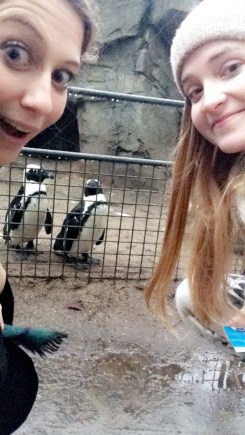
I believe this day ended with me asleep by 20.00.
* * *
Day 1: I woke up bright and early to go to the Stedelijk Museum. When I was abroad, I was absolutely OBSESSED with the Stedelijk. This museum is where my thesis topic was born. It started as a research paper for one of my abroad classes, A Social History of the Netherlands. In April and May I spent about four hours a day, five days per week in the Stedelijk research library reading old documents. When I left Amsterdam, I decided to turn this research paper into my senior thesis.
The topic of the original research paper- and my senior thesis- is the art movement Cobra. Cobra stands for Copenhagen, Brussels, Amsterdam- the three cities from which the major members of this group originated. I am specifically focusing on the Dutch members of this group, and exploring how the socio-political atmosphere in the Netherlands following World War II led to the groups’ creation.
My research necessitated me returning to the Stedelijk, this time to perform visual analyses on several different works, rather than to visit the Stedelijk library. The museum feels like home to me, and I was beyond excited to go back.
I first took a look at some Mondrian paintings. The following is a work entitled Composition No. IV, with Red, Blue, and Yellow (1929). On the right is a detail of the viewer’s bottom left corner.


And here is another Mondrian work, entitled Lozenge Composition with Two Lines (1931).

Mondrian was the founder of an important Dutch art movement called De Stijl. You can read a bit about the movement here. What characterizes De Stijl is an emphasis on geometry and primary colors. At the time of its founding in 1917, the movement was radical. It represented the next step in the breakdown of traditional art-making. Mondrian and De Stijl are important for my research because I am investigating the reasons that Cobra came about in the 1940s. De Stijl was the primary Dutch art style before Cobra, so it’s important for me to understand its theories and methodologies. Only then can I ascertain why the Cobra artists rejected De Stijl in favor of something new and different.
Take a look at these two works. What words would you use to describe them? How are line, color, shape, space, texture, and light utilized? These are called formal aspects, and they’re useful for comparing works.
Next, I went to the Cobra room, where I promptly almost fainted of happiness. The following is an incredible three-dimensional work entitled Cat, by Constant Nieuwenhuys (1948). Constant was one of the Dutch founders of Cobra, and one of the central artists in my research.

Here I am looking more composed than I feel with Cat.

I’ll be publishing a post soon where I go into detail about the progression of Dutch modernism through key works, so take a moment to think about how Cat compares to Composition No. IV or Lozenge Composition. How are the formal aspects utilized in different ways? And how does each work make you feel? Really focus on that sensation, as both Mondrian and Constant painted to evoke a sensation in the viewer. Furthermore, Constant actively despised Mondrian’s works. Why do you think this is?
Here is another Cobra work from this room entitled Questioning Children, by Karel Appel (1949).

Here’s a detail of the three-dimensional work made from paint on wood.

Appel and Constant worked closely together. What do Cat and Questioning Children share that Mondrian’s paintings lack?
Day 1 was made even more strange by my run-in with the famous Dutch talkshow host Humberto Tan. I was on my way to buy clothes (luggage was still not returned at this point) when he stopped me on the street and asked to take a photo of me for his street blog. I figured he was a photographer. Several screaming girls asking for selfies later and I realized he was a famous figure on Dutch TV. Go figure. Here we are smiling. You can still see the jet lag/confusion in my delirious eyes:

* * *
Day 2: Day 2 was, essentially, the reason I came to the Netherlands. I called the Stedelijk museum several months ago to inquire about the works that would be on view at the museum in January. I was directed to the head of the offsite depot, where the entire Stedelijk collection is stored when it’s not on view. Museums only display a small fraction of all the works they own, so offsite depots are massive! The head of the Stedelijk depot informed me that, because I was doing research, I could request any works from the collection to study during my visit. I chose 7 paintings and 1 print, all by Dutch Cobra artists.
I arrived last Wednesday at noon feeling extremely excited. I had been looking at tiny thumbnails of these works on my computer screen, and I was about to see them in person! The building itself was very imposing, with barbed wire and an electronic gate. My taxi driver actually asked me if I was visiting someone in prison.
Anyways, I walked into the viewing room and was completely stunned for several seconds. The colors of these paintings were more vivid than I’d imagined. They leapt out at me like they were alive, swimming within the confines of their wooden frames. Here’s a snapshot of a portion of the paintings I selected:

And here I am feeling rather posh between two of my favorite works:

Now, two of the works that I selected were oil paintings by Karel Appel, painted before Cobra. Sitting Girl and Sailor Girl were both created in 1946. Take a look and answer this question: What styles or artists do these works remind you of?


Sitting Girl reminds me of Modigliani’s manneristic portraits of women with elongated necks. Compare Sitting Girl to Jeanne Hébuterne (1919). Sailor Girl reminds me of Picasso’s simplified, deconstructed figures. Do you see a similar utilization of line and color in Picasso’s Girl Before a Mirror (1932)?
I was interested in looking at these two works because I am demonstrating in my thesis that the future members of Dutch Cobra did try out the styles of different contemporary artists. What they found- which is well documented in their published periodicals- was that these styles were not sufficient vehicles of self-expression. They rejected cubism. They rejected all kinds of genres. In order to show that Cobra was a result of the socio-political climate of the Netherlands following WWII, I must first explain that contemporary modes of expression were inadequate for artists struggling with the social and political conditions in Holland.
The following work is perhaps the most haunting of all. Constant Nieuwenhuys painted Concentration Camp (War) in 1950.

How do you feel looking at this painting? I imagine rather sad, especially given the fact that the title is Concentration Camp (War). Yet the sadness comes from within the painting. It does not feel as if the title were slapped on like a price tag. How does Constant achieve this mood? How does he manipulate line, color, shape, space, light, and texture to evoke sadness? I was particularly struck by the use of line and shape to create otherworldly beings with whom I feel an empathetic and spiritual connection.
I also was shaken by another of Constant’s eerie paintings, The War (1950).

Are you starting to see similarities in the subject matter of Dutch Cobra art? Remember that 75% of the Dutch Jewish population were killed in the Holocaust. Hundreds of thousands of non-Jewish Dutchmen died when German blockades caused famine in the last winter of the war. This was a population that had known suffering and death. It’s not surprising that the Dutch Cobra artists felt compelled to express their pain by depicting these dark subjects.
But what about the style of these works? Are you starting to see trends regarding the formal aspects of Dutch Cobra art? In The War, the outstretched arm of the central figure captivates my gaze. It is very much alive, reaching into the air against a backdrop of fire and decay, though it sits atop a mound of dead creatures. This dichotomy is gruesome yet compelling and utterly devastating.
Here are the last three works I studied. The top left is Constant’s Dead Cows (1951). The top right is Constant’s Scorched Earth (1951). (For all my history buffs out there, think about the term ‘scorched earth’ and how it was applied as a military tactic in the Second World War.) The gouache print at the bottom is Cornielle’s Composition (1948).


The Dutch Cobra paintings really are beautiful, aren’t they? Yet they also manage to be uncanny, sad, gruesome, and desperate, sometimes all at the same time. I think that’s why I like them so much. I am fascinated by their historical context, but also by the tension within each work. It is as if the artist himself couldn’t decide if he was hopeful about the future or resigned to the death of humanity.
After my four hour visit to the Depot I met up with my Dutch language teacher, Lisa. She took me for coffee and then to her work borrel. A borrel is a Dutch party for a specific group of people. You could have a tennis borrel for the members of the tennis team, or an art history borrel for art history students. I met all of the creative people she works with at this fun party! Here we are smiling:


* * *
Day 3: I woke up on Thursday at the Hilton Apollolaan, where I spent two of my seven nights in Amsterdam. The rest of the time I stayed with Sofi. Here I am wearing a coat I impulsively bought the day before from Daily Paper, ready to start the day:

I headed south to Amstelveen, the city right below Amsterdam, to visit the Cobra Museum. This museum is entirely devoted to the works of the Cobra artists, including the Dutch, Danish, and Belgian contingents of the group. My intention in visiting the Cobra Museum was to perform visual analyses on the works of Danish artists. After the Dutch artists rejected De Stijl, cubism, and a number of other genres, they encountered the Danish Expressionists. This interaction led to the creation of Cobra and the development of the works like Concentration Camp (war) and Dead Cows.
Carl-Henning Pedersen painted Salomon’s Kingdom in 1939. Take a look:

Do you see a relationship between this painting and the works by the Dutch Cobra artists? Does Pedersen handle formal aspects in the same way? How does his subject matter compare? I am particularly drawn to a quality of creaminess on the painting’s surface that is missing from the rougher Cobra works… but I see a lot of similarities in color and shape. What do you think?
The following is a painting by Egill Jacobsen entitled Sea (1947).

And here is an untitled work by Asger Jorn painted in 1949.

Just by looking at Sea and Untitled, it is clear that the Danish artists (and the Dutch artists, for that matter), were not clones painting identical pictures. The point in comparing works is not to conclude that the whole movement painted the same subjects with same color palette, but to draw connections between works that point to a larger ideology and methodology. Sea and Untitled could not be more different in their utilization of color, but what about shape? There are haunting eyes, formed from small bubbles of color, in both works. When I look at both paintings, I have the uncomfortable sensation of being watched. See what other connections you can come up with!
* * *
Days 4, 5, 6: I only had three days of research which left three days for visiting old friends and enjoying the city. However, as I left the hotel to go to my friend’s apartment, I started chatting with the concierge. And wouldn’t you know it, he agreed to take me on a tour of John Lennon and Yoko Ono’s famous honeymoon suite. Instead of going about and enjoying Amsterdam, the couple spent their honeymoon in bed, protesting the war. They called this the “bed-in for peace.” You can read more about this story here. I took lots of pictures of the suite. Take a look!


And of course I had to get a picture of myself in the suite. I wanted to lie down on the bed and pose but didn’t think that’d go over too well with housekeeping, so I went for this pose instead:

My last three days were an absolute whirlwind. I went to my favorite Dutch restaurant, Moeder’s, for traditional Dutch fare with my friend Tiemen. I went back to my old dorm with my old suitemate Ellie who has since moved to her own place in Amsterdam. I cooked dinner with Ellie and our other friend Thijmen, and many meals with my host, Sofi. I reconnected with some friends I lost touch with and we went out dancing to my favorite club, De School. On my last night, Sofi took me to her favorite bar and I got to meet all her friends! Here’s a little collage of my time spent with wonderful friends last week:


I also managed to spend all my emergency money on clothing. If you’re in Amsterdam and in need of some clothes to wear because your suitcase was also left in Dublin, check out The Girl Can’t Help It, a 1950s-style boutique. Also stop in to T.I.T.S. for whimsical, feminist designs and Nobody Has to Know for ageless, genderless, and sizeless clothing.
* * *
That’s all for now! I hope you enjoyed reading about my research trip to Amsterdam. I have been mostly writing exhibition reviews as of late, and it made me quite happy to share my everyday adventures with you all as well. Perhaps I’ll make a habit of it! Like I always say, inject art and happiness into your life at every possible moment.
Until next time!
xoxo, Chloe <3

This sounds like an amazing trip (at least in regards to the art part of it ;p). I am super intrigued by the Niewenhuys pieces, as they seem to have far-reaching influences, as if African art or South American art was a major influence in his works. I wonder if that connection exists, and if there’s any more similarities between Cobra art and art from those regions. Maybe we shall have coffee (tea? crumpets? water?) and discuss this in more detail, as I’d love to learn more about these similarities. You sound like a very nice young lady, and a budding scholar in the world of art history! I hope to make your acquaintance soon!
Amsterdam is rightfully considered one of the most impressive and colorful European cities. It is a city of organic merging of seemingly incompatible things!