As an emotional practice, art-making is inherently influenced by time and by place. To view the contemporary art of a particular city or nation is to listen to its people, to feel its steady pulse. Several weeks ago, I attended the graduation exhibitions for two of the most prestigious art programs in Europe—the Royal Academy of Art in The Hague and the Gerrit Rietveld Academie in Amsterdam. Though not all of the graduates are Dutch, they have spent formative years in the Netherlands, their art-making molded, in large part, by Dutch visual tradition and values. I entered both exhibitions with an open mind, eager to grab hold—however loosely—of what it means to be an artist in the Netherlands today.

One quality shared by many of the exhibiting artists is a penchant for the interdisciplinary. Material and conceptual boundaries mean little to these graduates, for whom other disciplines may provide potential ornamentation or even necessary tools. This transcendence of boundaries is politicized; in re-contextualizing traditional materials, the artists interrogate the social history of material culture. Notably, many artists at both academies involve the viewer in this process, dissolving conceptual barriers between art and daily life.

Another prevalent pattern in both exhibitions is a focus on process, which sometimes manifests itself in visually minimalistic work. This is not a bad thing, though my subjective tastes lean towards the hyperbolic; the strongest process-based works never sacrifice the image, whether said image is minimalist or maximalist in nature.
Related to this musing is my observation that painting receives no special treatment at the Rietveld and Royal Academies. It is but one of many practices within the Fine Arts, and furthermore, it leans towards abstraction. That the most striking paintings blur the line between figuration and abstraction is no coincidence; the artists use such micro-disciplines as tools to express feelings that are larger than arbitrary labels.
In this essay, I look at nine artists who embrace this point of view. I begin with a discussion of artists whose work investigates the cultural significations of human anatomy, as well as the relationship between oneself and one’s body. Next I turn to several artists who exalt ambiguity, whose work hovers uncannily between figuration and abstraction. Third, I look at three artists investigating identity politics through visual and conceptual interrogations of language. And lastly, I encounter an artist who dissects the significance of dress and self-adornment in the performance of identity.
* * *
ANATOMY

Photograph by Nikola Lamburov
Fine Arts graduate Rixta van der Molen attributes her interdisciplinary practice to the curriculum at the Rietveld Academy, where the first year is spent exploring different mediums and sensibilities. It was during this introductory period that the artist first encountered performance art and incorporated the practice into her work, which before then had been mostly sculptural. Van der Molen also considers the ideological motivations for the trend towards interdisciplinary art-making. “I feel many current artists tend to embrace the more unclear and fuzzier parts of human experience,” she explains, “which might spark appreciation for the multi-sensory.”

Photograph by Peter Velthoven
Phallic High Society, van der Molen’s sprawling installation for the Rietveld graduation show, stages such ‘fuzzy’ experiences by fusing performance and audience participation with sculpture. A sea of phallic monoliths rise up into the sky, forming a metropolis of penises the viewer can peruse. Peculiar details, like a squiggly tail that protrudes from the balcony of one such phallus, render the scene somewhat Seussian. I am also reminded of the strange landscapes in the animated French classic, The Fantastic Planet. These references, though likely subconscious, speak to the artist’s language of communication. She excels at crafting intriguing forms, adorning motifs with details that pique the viewer’s curiosity.
The same material used to construct these phalluses—modeling wax and grid wire—composes a bar, which goes mostly unnoticed until the artist walks behind it and offers visitors a drink. She serves us a cocktail mixed from lychee juice and tea-infused vodka, and subsequently inquires if she may read us a poem. We nod.

I went to the jungle/It was yesterday/I saw a snake eat a Hitachi Wand/And a bottle of Tanqueray.
Van der Molen recites the poem confidently, if not a bit flirtatiously, but always performatively—any sensuality she projects is mediated by the bar between us. I am aware of this sculptural mass that connotes the transaction occurring between bartender and drinker, artist and visitor, she and he. (I am a she, but I imagine that fifty percent of the artist’s patrons will be men.)
A final cheeky stanza teases the viewer with the possibility of sexual interaction, only to dismiss such hopes. He or she/Who is without sin/May cast a dildo upon my face/But only I can put it in. These lines encapsulate the essence of Phallic High Society, an installation that is really an exploration of shifting power dynamics in a gendered landscape.

Photograph by Nikola Lamburov
On one hand, van der Molen’s role as bartender is passive. “People forget that smiling is very submissive,” the artist notes. “An ever-smiling server is making a submissive gesture, and many people take offense if their servers don’t show this submissiveness.” But on the other hand, the bar is the fulcrum of the evening, the provider of the spirits that fuel the heterosexual mating dance. Throughout her performance, van der Molen embodies this paradox, exhibiting behaviors that activate certain gendered power dynamics between artist and viewer. She smiles at us, holds eye contact, and lets her voice lilt gently up and down as she recites her sensual poem. At the same time, our silence indicates her dominance. “If I manage to direct my audience, I’m in control,” the artist explains. And so, she oscillates between docile and domineering, sweet and mesmerizing.
Beyond the dichotomy van der Molen describes is a third mode of perceiving the pretty woman on the other side of the bar: fear. In her intoxicating poem, the artist speaks of a snake who engages in acts of vice, recalling Eve’s temptation in The Garden of Eden. The first woman’s sins doomed mankind to a life of suffering on Earth, and women to a life of blood-loss. Van der Molen relishes these phrases, her voice softly rising and falling like the slithering body of a snake. In these moments, the artist is dangerously alluring, an embodiment of femaleness as it was defined by Original Sin. The myth of Original Sin affected the treatment of women in the Medieval Period. Women, perceived as more easily prone to temptation, were accused of colluding with Satan to bring about the end of the world. Such ties between Satan and femaleness– often considered coital– made female flesh a site of evil, and female knowledge a threat to male power.
In the twenty-first century, this perception of femaleness remains in the minds of incels, for whom women are objects they deserve. It also prevails in slut-shaming discourse that demonizes female sexual enjoyment. In Phallic High Society, van der Molen plays the submissive and the dominant, but she also plays the dangerously powerful woman as defined by the male gaze. She has power over the phallic skyscrapers that dot the nearby metropolis. Though their skeletons are made of hard metal, their waxy burgundy flesh threatens to melt in the summer sun.
* * *

Courtesy of the artist
I would love to see van der Molen’s installation in a room adjacent to that of Suzanne Plomp, a graduate of the Royal Academy. Plomp’s anatomical structures of the female body—Cocoons and Come with Me—respond to the same patriarchal conditions that engendered Phallic High Society. Both artists magnify the size of the reproductive organs to draw attention to the connotations of male and female genitalia, and the psychological responses each elicits in the viewer. And like van der Molen, Plomp studied in the Fine Arts Department, though her recent work is rooted in the material of a different external discipline—textiles.
The artist describes her time at the Royal Academy as similarly interdisciplinary, with her first year spent taking workshops in metalwork, woodwork, and textiles. She notes that this curriculum fosters open-mindedness and provides students with a diverse set of skills—both of which are “essential” for artistic development. But Plomp doesn’t view interdisciplinary art-making as a local trend. “Worldwide, I see artists and designers from different disciplines collaborating,” she says, “and I think that’s very exciting.”
To sculpt her anatomical vessels, Plomp seeks materials that behave like organic tissues. Textiles suit her needs, most notably sisal rope. Because textiles are associated with women’s domestic work, it easy to assume that Plomp’s knitted sculptures of female genitalia are a nod to female labor and domestic craft. But while the artist recognizes the gendered history of her chosen medium, she believes recent innovations in fine art have given the material added meaning. Her sculptures reflect the female experience through less obvious means, trading connotations of domesticity for the language of monstrousness.

Courtesy of the artist
Plomp is inspired by the titular creature in Ridley Scott’s Alien (1979), whose reproductive system has been described as female. The concept art drawn by H. R. Giger for the film emphasizes this link, particularly in this drawing of an alien that resembles an embryo with a phallic head. “Although the alien has a monstrous appearance, it has its own anatomy, logic, and beauty,” the artist explains. “The alien is a symbol of growth because. of… the way its development takes time and practice to understand.” She sees herself in the alien, a compound of “beauty and rawness,” one who seeks acceptance and understanding. Though sisal rope appears soft to the eye, its coarseness leaves the artist with blisters and cuts. Plomp explains that this dichotomy is a reference to the physical violence she has endured. Like the alien, she is beautiful and full of hope. And like the alien, violence has been inflicted upon her.
Plomp’s affection for Alien is radical given the history of feminine monsters allegorizing male fears. As I explained in my analysis of Phallic High Society, early Christians associated the female body with Satan. Subsequent depictions of monsters in both medieval and gothic texts figured enlarged female body parts, rendered gruesome to incite fear in the viewer or reader.
Ridley Scott’s titular alien can be read as the contemporary reincarnation of such monsters, as its female sexuality is posed as a direct threat to male livelihood. By embracing such creatures and showing them compassion, Plomp unravels the myth of female monstrousness. Rid of their sexist charge, giant red vulvas and fuzzy pink fallopian tubes are no longer frightening, but beautiful and full of hope.
* * *

Courtesy of the artist
A teacher at the Royal Academy once told Nanhee Kim, “It doesn’t matter what you paint, it only matters how you paint.” This lesson encapsulates the spirit of Dutch painting that I saw at the graduation shows; a focus on process that dictates image, rather than the reverse. Kim’s paintings hover between figuration and abstraction as a result of this methodology, although they are all rooted in somatic iconography.
Abstraction and figuration may not be disciplines in the traditional sense, like ceramics or fine art, but I assert that they function as such within the world of painting. Each has its own history, method of evaluation, and relevant techniques. The fusion of these micro-disciplines by contemporary Dutch painters is motivated by the same desires that provoke sculptors like van der Molen and Plomp. They all seek to convey their ideas through the most appropriate iconography, while utilizing the most suitable materials. For these artists, idea and process trump the pre-determined image.

Courtesy of the artist
This paradigm is especially clear in Kim’s work, which slides closer to abstraction or figuration with each new painting. The artist is evidently unattached to one particular mode of representation, preferring to let concept and process determine the degree to which the subject is rendered figuratively. In the works exhibited at The Royal Academy, Kim displays a range of subjects related to the human body, and are therefore aesthetically quite varied.
Eat My Vase situates the viewer beneath the thick chin of a person performing oral sex on a partner. This unusual angle has the effect of rendering the painting somewhat abstract; a circle is noticed before it is identified as genitalia, and a pink mass is observed before it can be accepted as a ruddy red neck. But despite the apparent reduction of certain body parts to mere shapes, the painting is not an exercise in geometry. Rather, it is an exploration of sensation from a new vantage point. That we are unaccustomed to seeing oral sex performed from this angle speaks is a reflection of social norms.

Courtesy of the artist
Other works in the artist’s oeuvre enlist the uncanny to achieve the desired balance between figuration and abstraction. In Untitled (I), a plethora of sharp, toothy mouths threaten to engulf the viewer. The central figure is humanlike, but afforded an extra limb or two, and its long drooping breasts are oddly phallic. Untitled (I) thus resides between genders, occupying a hazy space that is also home to the ambiguous place between abstraction and figuration.
Other works are less abstract, including I Wanna Lick My Pussy, But I Can’t, and Untitled (II), which follow the spatial rules of traditional portraiture. In each, a single humanoid figure who is depicted from the front fills most of the canvas. However, Kim situates each subject in a field of expressionistic color, detaching them from reality as we understand it to be. The artist also alters their bodies to uncanny effect; doubling eyeballs, gaping mouths and snaking tendrils around their skin. These idiosyncrasies are clearly departures from traditional figurative portraiture, but register more-so as grotesque bodily functions rather than forays into vacuity.

Courtesy of the artist
Regarding these uncanny bodies the artist says, “A body can hold many things. We see the world through our bodies, as well as our desires and anxieties.” Perhaps Kim’s amorphous anatomies can be read as phenomenological visualizations. The study of the lived-body experience, phenomenology is a useful lens through which to read the artist’s ambiguous subjects. Their ambiguity performs the complexity of human emotion. Untitled (I) is frightening because it is uncanny, but also because the subject exudes sensuality. One arm stretches to the sky, revealing a sensual indentation of skin coated with soft brown hair, while disembodied pink hands distend from an external source to caress him/her/them. The repeated mouth motif, grinning garishly in a blue-striped funhouse is simultaneously whimsical and unnerving. Confusion, desire, and fear—these are just a few emotions that exist concomitantly in our minds. Kim externalizes this concomitance with bodies that are as complex as the souls that inhabit them.
* * *
THE UNCANNY
With my discussion of Kim’s paintings I have transitioned into the second part of this essay, which is an examination of the uncanny in contemporary Dutch painting. Like Kim, the artists Jinbin Chen and Rinella Alfonso draw from the micro-disciplines of figurative and abstract representation. They are also recent graduates of the Royal Academy of Art, where I was particularly intrigued by the paintings on display. Despite the artists’ shared tutelage, their opinions vary widely concerning the popularity of minimalism/abstraction in Dutch art. Kim and Chen observe a multitude of figurative painters in The Netherlands and at the Academy, though the latter concedes that abstraction is more apparent here than in German, Chinese, or Belgian contemporary art. Alfonso asserts that the Fine Arts department supports all subgenres, but that abstraction has become quite popular as a result of students’ shared interest in materiality rather than image.
After reflecting on these artists’ responses to my observations, I came to the conclusion that I have outlined over the course of this essay; that the strongest work at Dutch art schools derives its iconography from concept and process. I have already discussed Kim’s creaturely figures, whose visualization of anatomy is never purely abstract nor figurative. Chen and Alfonso dive deeper into this uncanny space between reality and materiality, questioning the very definitions of image and content.
* * *

Courtesy of the artist
Jinbin Chen’s paintings are, at first glance, figurative. The artist depicts name-able objects, like a disembodied head with glowing eyes– in the evocative painting Sleeping Muse–and an untitled painting of creamy seashells. In each, large expanses of the canvas meant to indicate skin or stone are impeccably blended, the evidence of the artist’s painterly hand disappearing into an iridescent mirror. These tangible fields of color glow as if imbued with sublimity, a quality that translates to the artist’s subjects; the eyes of the sleeping muse and the bodies of open shells become divine portals.
Where the artist’s work approaches abstraction is in the treatment of these sublime expanses. Chen’s attention to surface promotes materiality to the role of protagonist, alongside the artist’s subjects. Figuration and abstraction coexist in a delicate balance, which Chen describes as “the duet affect in painting”—a reference to the Deleuzian theory of affect. To achieve this affect, the artist seeks to remove the quality of narrative from its context, such that “the content [may] function as the process rather than the goal.” Chen depicts this isolated nucleus of content with a certain degree of intensity, rendering the work communicative but not didactic.

Courtesy of the artist
We see this in the artist’s tender treatment of the egg in Sleeping Muse. The egg is identified only by its perimeter, which surrounds the pool of dazzling color. It thus exists in its most purified form, its origins and species unknown. We don’t even know its relationship to the person sleeping soundly beside it. And speaking of which, its companion is also stripped of his identity; a face with the only the most necessary features, and eyes storming blue and grey.
A similar removal of narrative is performed on a group of seashells in Chen’s luminescent, yet untitled painting. Although surrounded by an opaque wash of navy paint, the shells are not specifically situated on an ocean floor. In fact, there is nothing salty or sandy about their surroundings, as smooth and licked as the surface of a Caravaggio. Their content– harmonious colors and shapes– has successfully been extracted.
It’s important to note that Deleuzian theory is not the locus of Chen’s work. Rather, it is a tool with which the artist isolates and communicates the essence of his paintings to the viewer. According to Chen, only content that is freed from its narrative constraints can achieve true intimacy. Thus, the elimination of anecdotal detail from each painting provides the viewer a more intimate encounter with the work. By spreading the intensity of the content across the canvas, the artist creates a warm environment for viewers to feel embraced.

Courtesy of the artist
What does this mean for the viewer encountering one of Chen’s paintings? We are given free rein to attach our own associations to the artist’s foundational images, that much is clear. And we are also meant to feel enveloped in his work, a sensation I experienced as I gazed at his alluring seashells. This is notable given his attraction to the uncanny, a quality that is often attached to work that aims to unnerve the viewer. Rather than elicit fear of the unknown—a frequent effect of creaturely bodies in surrealist art—Chen seeks to hypnotize. To gaze upon these works is to experience pleasure of seemingly mystical origin.
Chen’s paintings derive their sensuality from the distribution of intensity across the surface of each work. The warm environment created by the duet affect is simultaneously erotic. “For me, eroticism is never only about pornography,” Chen says. “It is about pursuing the maximum contact area of skin.”
Despite the clarity with which I have attempted to detail Chen’s ideology and methodology, I urge the reader not to view this analysis as a rigid structure. “I do not like the idea of a perfect artist who can always fill up the gaps of his own theory,” the artist says. And because of this, he concludes our conversation with an assertion that his paintings are simply encounters with bodies. “I see the possibility of this concept to transcend existing forms and experiences,” he adds. “It is open enough to accept the unknown.”
With this in mind, I choose not to forget what I have learned from Chen about the duet effect and the de-contextualization of form. I view both explanations concomitantly. The artist’s paintings are simultaneously warm and cool; erotic and sublime. A visualization of a Deleuzian philosophy and an image that cannot be described with any words we know. An uncanny assemblage of paradoxes that are paradoxically pleasing.
* * *

Courtesy of the artist
Like Chen, Rinella Alfonso is interested in the content of imagery detached from its original context, but she relies more on examples than theory to explain her approach to iconography. The artist describes commercials for Old Spice as a representation of de-contextualized imagery. “There is no story behind [each commercial],” Alfonso explains, “but the ad is memorable because it attracts the viewer with recognizable forms, which interact dynamically and unnaturally within the space.”
I find it interesting that the artist points to such figurative displays of isolated form, when her own work departs further from anatomical renderings. But after consuming my fair share of Old Spice commercials, I understand that Alfonso is drawn to the brand’s absurdist treatment of objects. Cars, shower stalls, dirty couches, the gym; these are all recognizable spaces that bear connotations of masculinity, but hyperbolic dialogue and surrealist plot-lines construct new stories from these motifs. But despite this, I would argue that the masculine connotations in Old Spice commercials never fully disappear. They could use another round in the blender to shake up their contents.
Alfonso’s paintings function similarly to these commercials, though her paintings are more surreal, as if the artist has filtered her chosen motifs through a sieve again and again, trapping their anecdotal bits, and just leaving pure form to gather on the canvas below. Alfonso describes this purified mass as the “information of the image,” which communicates through its “color, spatial volumes, and space.”
And communicate they do, their vibrant hues and tangible textures practically leaping off the canvas. But it’s not easy to contain their ‘words’ to a single thought. A side effect of interdisciplinary art-making—and in this case, the synthesis of figuration and abstraction—is a multiplicity of signification. Viewers are given an abundance of mediums and images through which to interpret the work, and with which they likely have pre-existing associations.

Courtesy of the artist
Alfonso embraces this phenomenon, entrusting the meaning of her work to the individual’s experience viewing it. “I wish the viewers to trust their own feelings,” the artist says, “[to] let their associations run wild and to give into this new world that does not make sense to them.”
My interpretations of Alfonso’s work demonstrate their multivalence. The Unveiling of the Leg has a ghostly quality, as the folded pink form climbs like a ghost within a rosy sheet up an invisible clothesline. The title indicates that a person is instigating this movement, and also eroticizes the fleshy blue masses of paint. Corset Training features a distorted hourglass shape that draws its uncanniness from both form and texture; its symmetrical shape recalls the female reproductive system while crusty mustard paint surrounds thin regions of thick red goo. Upon learning of the painting’s title, I begin to see the a corset bound impossible tight; perhaps the ovaries have been squeezed out either end.

Courtesy of the artist
The artist herself cannot even be sure of the imagery that will result from her process of de-contextualization. In the construction of Sweetheart Candy necklace, Alfonso attempted to paint the sugary motif in some sort of clamping contraption. But the colors and textures had a mind of their own, the artist claims, dictating the path of the necklace through a series of finger bones instead. The resulting painting, which resembles an x-ray, depicts a frosty green skeleton whose bulbous knuckles are bisected by a metal chain. The gruesomeness of this image is offset by the artist’s soft brushstrokes and her pleasing pink and green palette. The dichotomies of figurative and abstract, and grotesque and sweet, give this last painting its uncanny character.
* * *
LANGUAGE
A number of artists from both the Rietveld and Royal Academies are concerned with language and its relationship to identity formation. Jan Janssenwillen, a recent graduate from the graphic design department at the Rietveld Academy, claims that his interests have always extended beyond graphic design. He previously studied architectural design and fashion branding, and his graduate work has culminated in a social media platform, scholarly research, and a multi-media installation. “It feels natural to search for the ideal medium for each project,” Janssenwillen explains. “It comes down to knowing what your message is, through which mediums to communicate this, and to whom you are talking.” The artist believes this way of thinking is generational, noting its prevalence at the Rietveld Academy. “If you walk through the graduation show you sometimes lose track of which department is where,” he adds.
In this essay, I will look at the social media platform and collectable zine that Janssenwillen created for the graduation exhibition. Both are sociologically-minded in content and in format, as a result of the artist’s engagement with the queer club scene in Amsterdam.

accessed from desktop
GENDER*LANGUAGE is an Instagram account that compiles excerpts from essays on gender identity into educational stories and posts, and links to a dropbox with full text PDFs of each. The artist chose this format with the experience of the reader in mind, delivering information in palatable chunks rather than “bombarding [readers] with theory.” The design of GENDER*LANGUAGE complements its content. As a student of graphic design, Janssenwillen is aware of the ways sexism and queerphobia in typography have privileged the typefaces of cis male designers over their female and queer peers. In response to this imbalance in the industry, the artist utilizes typefaces designed solely by female and/or queer typographers, who are always credited.


In many of the essays quoted in GENDER*LANGUAGE, authors delve into the ways that gender is coded in spoken word and written text. Janssenwillen makes a strong case for the relationship between gendered pronouns and the visual representation of language, as communicated through different fonts. The former has been publicized in recent years—at least in liberal hubs like Amsterdam—though most computer users are unaware of the gendered nature of the typefaces they consume. GENDER*LANGUAGE capitalizes on the format of social media to start a dialogue about language, and the way binary notions of gender have historically been utilized to order society and privilege certain groups.

Courtesy of the artist
In his thesis, Front Left–Politics of club culture, a crisp black and white zine, Janssenwillen explores the politics of safe spaces and queer community through text. I bought a copy because I was intrigued by the artist’s social media work, and wanted to see how he presented his thoughts in a different medium.
Instead of a traditional cover. the artist has wrapped a poster around the first and last pages of the zine. This poster, which was the impetus for the entire project, showcases a number of stickers handed out at Dutch clubs to cover visitors’ phone cameras. Clubs like De School, which the artist describes as the locus of the Amsterdam queer community, emphasize the safety of their attendees. Prohibiting photography allows guests to express themselves—through dress, dancing, and sometimes romantic and/or sexual behavior—without fear of being photographed. “People often keep these stickers on their phone covers,” Janssenwillen explains, “as a symbolic replacement or memory.” This affectionate practice is emblematic of the role dance clubs have played in creating safe spaces for the Dutch queer community. In Front Left, Janssenwillen uses these stickers as an entry point for his study of club culture and safe spaces in The Netherlands.
The title of the zine is taken from the popular theory that queer folk migrate to the front-left of the dance floor in order to meet one another. Janssenwillen explores the history of this practice from a sociological angle, but also embodies it in the layout of his text; the main paragraphs are shifted to the front-left of each page.

Courtesy of the artist
Janssenwillen created Front Left to share his love for his community with his peers, and with other individuals close to the queer club scene. But he was also eager to reduce the stigma nightclubs have garnered, by elucidating the way the queer community at De School fosters friendships and self-acceptance. In this way Front Left operates in much the same way as GENDER*LANGUAGE—as an educational tool that requires participation on the part of the viewer. By engaging with the artist’s texts—through reading, clicking, and liking—the viewer completes the work. Of course, for each new set of eyes and thumbs, GENDER*LANGUAGE and Front Left are ‘reset,’ and require additional action to be ‘completed.’
* * *

Courtesy of the artist
Klara Graah studied alongside Janssenwillen in the Graphic Design department at the Rietveld Academy, and her practice is similarly linguistic. The multimedia work How to Climb a Hill tackles the mythos of self-help through a fusion of illustration and graphic design—two genres that she believes are inherently tied to one another and to language. “Graphic design forces you to deal with text,” the artist says. “When you put text on an image, the text [becomes] part of the composition, so in a way the text is also illustration.” She also incorporates sculpture into her work through the use of play-doh, a material with hobbyist connotations. In her work, Graah seeks to fuse arbitrary definitions of fine art and craft—another example of interdisciplinary art-making dissolving conceptual barriers.

How to Climb a Hill is composed of three large panels, the middle of which is divided into quadrants, while the panels that flank it are bifurcated by three-dimensional white putty. All three are situated on the floor, with an inch or two between them. Within each scene, Graah presents stylized figures whose human-ness is questionable but whose emotions are resonant, communicated through visual and linguistic puns, and hyperbolic facial expressions.

Courtesy of the artist
In one humorous tableau, a purple snake with the face of a dog slithers through a forest, his boneless spine rising into a peak. A humanoid figure clings to him at this apex between ‘uphill’ and ‘downhill,’ which are conveniently marked on the creature’s body. These textual identifiers solidify the visual pun; the creature is both an animal and a hill at the same time, and the person clinging to him is dangerously close to a downward spiral.
Graah has read a number of self-help books, and has noticed a lack of humor in their approach to self-improvement. As this panel demonstrates, the artist’s visualization of self-help embraces humor.
The artist uses both language and imagery to make light-hearted jokes about viewers’ shared experiences, as well as the discourse of self-help. Because the orientation of the text is constantly moving, the viewer must circle the work in order to read it, and thus performs the process of climbing up a rather circular hill– a wry parody of the mythos of self-help. It is comedic that we rely on such meaningless motifs like mountains to assert the ‘true’ trajectory of healing. In reality, perseverance is a nonlinear path. As we circle How to Climb a Hill, it occurs to us that ‘reaching the top’ is insignificant. “Numbness is actually at the top of the hills,” Graah insists, and what matters is what we notice as we move through peaks and valleys. “The beauty,” she adds, “is in the effort we put into living.”
* * *
Ligia Maasland first attended the Royal Academy’s preparatory program, where a teacher from the Interactive Media Design program scouted the artist and encouraged her to consider a broader field of study. Although Maasland believed her work was rooted in graphic design, it actually incorporated a range of media, from Photoshop and installation art to painting and photography. “But my true passion,” the artist says, “was…fire. I burned paper and used the ashes to draw, and worked together with my high school’s chemistry teachers to make colored flames.” This unique process secured Maasland’s place in the Interactive Media Design department at the Royal Academy.

Courtesy of the artist
The artist extols the virtues of this interdisciplinary program, which teaches students skills from a variety of departments. This curriculum equips students with the tools to articulate any given concept. The artist also highlights the relationship between interdisciplinary art-making and art that strives for political or social change, a correlation I noticed strongly at both graduation shows. She attributes this to the perspective of her teachers, and to the diversity of the student population at the Royal Academy.
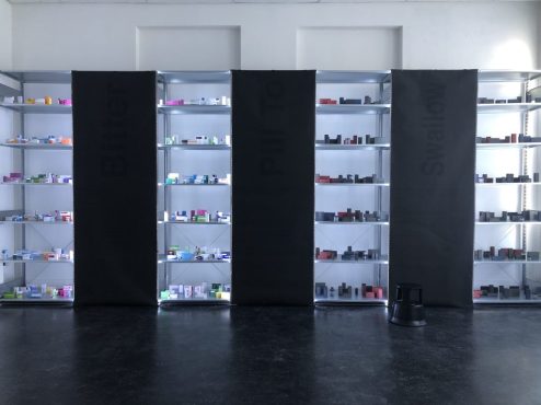
During her time at the Royal Academy, Maasland has explored language as it pertains to the discourse surrounding anti-depressants in the pharmaceutical industry. Her thesis installation, Paradox Medical Meal, fuses science, sociology, branding, and art, in the form of a makeshift pharmacy.

Courtesy of the artist
The installation is composed of a large shelving system with four units that reach the ceiling. Each shelf on the first two units is lined with carefully-spaced cartons of name-brand medications. The latter two units carry boxes that have been painted black, obscuring the words on the packaging. The units are separated by black panels that, at first, appear to be solid, but actually contain several lines of dark grey printed text.
Paradox Medical Meal has much to say about the pharmaceutical industry, and I enjoyed piecing together the artist’s point of view. But Maasland’s inspiration for this evocative work—described at length in her accompanying thesis—is as important as its visual effects.
The artist was prescribed antidepressants at the age of fourteen to treat her general anxiety disorder. For years, she has felt the stigma surrounding mental illness, a difficult burden to bear on top of the disease itself. Because of her medical history, the artist has always had a keen interest in studying mental illnesses, from their biochemistry and their treatment to the way they are perceived in society. In the last year, the artist felt stable enough to decrease her dosage of anti-depressants, and she noticed many of her symptoms subside. She realized that certain symptoms were side effects of her medication, rather than her anxiety disorder. This realization spurred the research project that became her thesis, and she soon discovered with horror that chemical additives were the source of her symptoms. The artist worked closely with a psychiatrist throughout her research, as well as her brother, a chef who studies additives as they pertain to food chemistry. These sources lend her thesis considerable scholarly weight.

Courtesy of the artist
Maasland argues that pharmaceutical companies utilize additives as a branding tool. If the company’s logo is green, the artist explains, “the pill should be green and the taste and odor should match their ideology.”Although pills with less additives have less side-effects, pharmaceutical companies continue to use them. Maasland believes that pharmaceutical companies have convinced the public that medicine must be branded to be reliable. As a result, customers will only buy brand-name medication, and companies continue to fill their drugs with additives.
Paradox Medical Meal is a response to these findings; an unnerving commentary on the lack of transparency in the pharmaceutical industry. When I first lay eyes on the latter two shelving units, whose contents are painted black, I observe them uneasily. I feel more comfortable visually (and physically) consuming medications whose names I can read, and whose brands I recognize. To learn that the fluorescent shelves bear the more dangerous medication is thus a disturbing revelation. How could something so seemingly transparent be so secretly sinister? And how is an anonymously branded pill actually safer to consume?
Courtesy of the artist
Maasland surveyed a group of high school students to answer this question. She found that the teens believed medication packaged in darker colors was more serious than drugs sold in light-colored packaging. The artist had unearthed a strange phenomenon: consumers are less likely to read the contents of a drug when said contents are blatantly listed, and more likely to research the contents of a drug whose ingredients are hard to read. Human beings associate legibility and brand recognition with trustworthiness, and illegibility and anonymity with danger.
Paradox Medical Meal sheds light on this pervasive paradox quite literally, playing with light and darkness, and transparency and obfuscation, to make viewers question the way they evaluate information. In her makeshift drugstore, Maasland forces us to focus intensely to read the text inscribed on dark black panels. But she also reminds us to read what’s clearly in plain sight. The message is clear: we ought to regard the medications we consume with as much care and attention as we do the walls of this installation. It is a fascinating utilization of design for the benefit of the viewer’s engagement with the text, demonstrating how language and visual media can be fused.
* * *
DRESS
Although the Rietveld and Royal Academies boast impressive programs in Fashion, Textile, and Jewelry Design, for the sake of brevity I have chosen to focus on one artist whose practice is particularly intriguing. Marguerite Bones, a graduate of the Rietveld Academy’s Jewelry department, draws additional inspiration from the fields of graphic design, fashion, architecture, fine art, and theatre.
Bones has found the artistic atmosphere in The Netherlands particularly conducive to her interdisciplinary practice, in contrast to her experience within the French art school system. When asked about the popularity of minimalism in Dutch art, the artist responds with a delightful “Fuck minimalism!” which I would like emblazoned on my tombstone. She goes on to acknowledge that trends in art-making are cyclical, which indicates that the return of ornament is part of a natural progression. The artist also recognizes the matter of taste in determining one’s preference for minimalist or ‘maximalist’ work, but makes a strong case for the relevance of ornamentation today.
Symbols, she says, refer to national aesthetics, and are therefore extremely significant in our political climate. Furthermore, imagery “refers to the history of [mankind],” Bones says, “and is influenced by biology, science, and digital technologies.” Lastly, the artist is keen to create work that evokes pleasure, which also feels topical in a political moment characterized by debates about sexual identity.
Courtesy of the artist
Bones has found her teachers accepting of her point of view and aesthetic tastes, likely due to the excellent framework through which teachers evaluate the students’ work; they consider the student’s personal motivations and subsequent artistic process, rather than a set of academic guidelines. Bones cites the Jewelry Department for redefining the limits of her practice. “You are brought to the complete destruction of its meaning,” the artist says, referring to the very term ‘jewelry.’ “Isn’t anything precious a piece of jewelry, as maybe your teddy bear or a picture? isn’t this building an amazing gemstone? Is superficiality useless? Can you wear an idea?”
Some of Bones’s peers have centered their practice around the possibilities these questions present to the field of wearable art. At times, it feels as if such sculptural works—which often, it turns out, cannot be worn—bear little additional signification. Such work risks irrelevance when the rest of the world catches up with a broader definition of jewelry. Bones’s work succeeds because the artist doesn’t concern herself solely with pushing limits and eliciting shock. Instead, she uses an expanded understanding of jewelry to visualize a deeply personal idea.
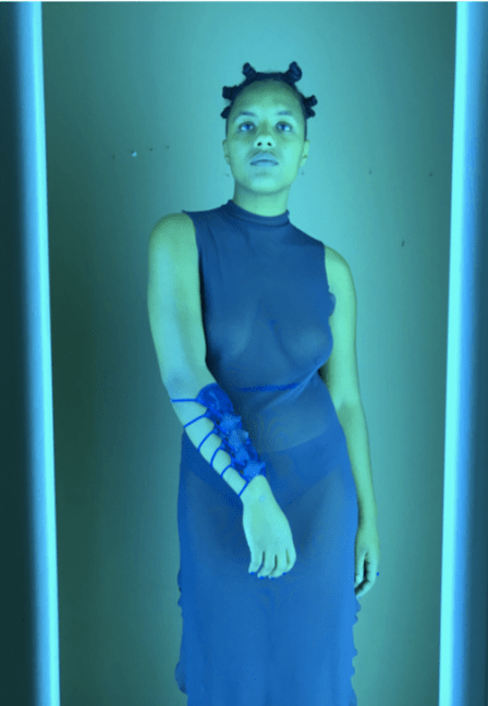
For her graduation project, Bones began with the goal to objectify her fears and feelings. She wanted the energy from these feelings to be transmitted through objects. In doing so, she would challenge the notion that feelings are abstract. Her early performances made her aware that wearing jewels made her feel both vulnerable and empowered. She began to craft metal ornaments that served as a reminder of her deepest fears, and a coat of armor against them. Meant to be worn on different parts of the body, her jewels draw attention to various weaknesses in the body, while simultaneously strengthening the wearer. According to Bones, her work “provides a material protection against social anxiety.”

by Marguerite Bones, Courtesy of the artist
The artist’s choice of materials—silver, leather, and silk—are traditional in the field of jewelry-making, but her vision is anything but. The notion of self-adornment as a kind of bodily armor is ritualistic, and recalls the ideology of medieval dress. This way of thinking is the focal point of Bones’s work, and she has chosen the proper technical and iconographic tools to express it—traditional materials fused with sociological and historical research.
The artist has filtered her obsession with medieval objects through the lens of contemporary video games, which often depict hyperbolic representations of medieval weapons and armor. Fetish aesthetics are also a strong influence, notable due to the ritualistic violence and power hierarchies employed in BDSM. These aesthetics overlap as well, due to the use of medieval motifs in the fetish world as emblems of power and identity. Bones’s jewels evoke such anachronisms of past and present, and dichotomies of power versus submission. A blue armband laced with grommets is distinctly warlike, but the dyed elastic thread that binds it to the arm signals submission. The bracelet’s bold hue identifies it as a contemporary object, as do the blue resin spikes that adorn a stainless-steel choker, which threaten to bloody the wearer’s skin.
Of particular note is an exquisite corset crafted from leather and elastic. Wound tightly around the torso of the wearer, the latter creates ribbons of excess flesh. There is something deeply vulnerable about the panels of exposed skin, peeking out from beneath their armor. Restrictive fabric and intricate straps are in the DNA of BDSM, so it is almost unnecessary to note the garment’s implicit eroticism. But it would be reductive to pigeon-hole Bones’ work into the category of fetish gear. Like the artist’s spiked choker and laced armband, the corset defies categorization. The juxtaposition of burgundy leather and violet elastic lend the garment agrarian and folk connotations, as well as synthetic and contemporary undertones. This corset belongs to neither vikings nor dominatrixes, but it respectfully pulls its strength and vulnerability from both.


Bones notes that the aesthetics of fetish are not new to art or fashion, but that they continue to represent empowerment and liberation in the BDSM community. I will add that the artist’s use of such aesthetics is, in fact, quite innovative, due to their contextualization within the realms of medieval materiality and contemporary self-help.
Medieval and fetish iconography identify the armband, the choker, and the corset as emblems of power, imbued with ritualism and sacrality. But these references merely signify the presence of such sacredness; anachronistic materials and conflicting allusions to dominance and submission prevent the wearer from claiming omnipotence. Instead, Bones’s jewels reflect—and contain—our feelings of both power and fear. Worn close to our bodies, they protect us from our weaknesses while never letting us forget them.
* * *
In the twentieth century, every new ‘period’ ushered in the acceptance of another material as ‘art.’ Artists were constantly pushing the limits of what could be considered art, and it is now well established that such limits do not exist. In my extremely biased opinion, that has affected the longevity of certain works that provoked debate in their time. So where do we go from here, now that art knows no material bounds?
These nine artists, whose shoes are still wet with paint from art school, have instinctively found the answer. Like me, they are of the generation that never questioned whether something could ‘be’ art. And if everything can be art, then why must an idea be diluted to fit within traditional artistic guidelines? If an idea suits the written word, then it ought to be scrawled or typed, or scribbled. If an idea seems destined to be knitted, then it ought to be communicated through yarn, ribbon, or hair.
I am not asserting that these artists invented interdisciplinary art-making. In fact, I am certain they did not. But I do believe it is notable that students in these prestigious Dutch art schools are thinking so broadly at the beginning of their careers. It bodes well for their futures that they have been taught to value their ideas over style or genre. I look forward to following their paths, which will undoubtedly lead them cross the globe, where they will utilize their skills to change people’s minds.
* * *